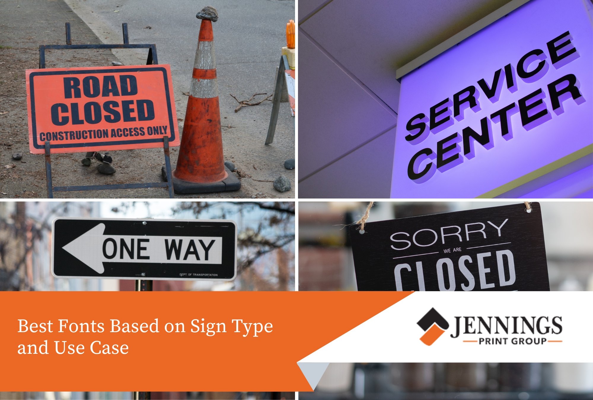
Unreadable signage causes confusion, especially in high-traffic areas or from a distance. Fonts that look stylish on screen often fail when used for physical signs—either due to spacing, sizing, or shape. This results in signs that people miss, misread, or ignore completely.
Readable fonts improve wayfinding, branding consistency, and safety. Proper type selection helps ensure your sign works in real-world conditions like sunlight, motion, and varying viewer distances.
This guide explains which font styles work best for different signage needs based on readability, application, and distance. Whether for street signs, shopfronts, or internal business signage, font choice makes a direct impact on visibility and communication.
Why Font Choice Matters in Signage
Font readability directly affects how quickly people can process information. A clear font improves visibility and reduces the risk of misreading or delays. This is especially important for:
- Safety signs and emergency instructions
- Business signage viewed from roads
- Wayfinding signs in large spaces
Poor font selection leads to miscommunication. Overly decorative or narrow fonts reduce legibility. Text that looks readable on paper may become distorted on metal, acrylic, or vinyl. Readability depends on how a font performs at different sizes, viewing angles, and lighting conditions.
Fonts also need to suit the physical space. A font that works on a highway billboard may not be suitable for indoor directional signs or shop displays. Matching the font to its environment helps maintain readability and brand consistency.
Best Serif and Sans Serif Fonts for Signage
Sans serif fonts are often more readable on signage because of their clean structure. However, some serif fonts can also work when used with care.
Top sans serif options:
- Helvetica – balanced spacing and clean lines
- Arial – similar to Helvetica but slightly rounder
- Futura – geometric and works well for modern signage
- Frutiger – designed for signs and wayfinding systems
Readable serif fonts (if needed):
- Georgia – thick strokes and clear spacing
- Times New Roman – best used for close-up or printed signage
Sans serif fonts are usually best for outdoor or distant viewing. Serif fonts may be used for indoor or static signage when used at larger sizes and with proper spacing.

Font Size, Weight and Spacing for Legibility
Font readability is not just about typeface—size, weight, and spacing also matter. A readable font must be paired with proper layout choices to maintain visibility.
- Larger fonts are easier to read from a distance. As a general rule, 25 mm of letter height is readable from about 10 metres.
- Medium or bold weights work better than thin or ultra-light versions, especially in outdoor or low-light settings.
- Adequate letter and line spacing prevent the text from blending together.
Avoid condensed or overly stylised fonts. Compressed fonts reduce the white space between letters, making signs hard to scan at a glance. Rounded letters tend to work better than narrow ones, especially on fast-moving signs.
Best Fonts Based on Sign Type and Use Case
Different sign types benefit from different font styles. Below are common sign categories and font recommendations:
| Sign Type | Recommended Fonts | Reason for Use |
| Traffic and Street Signs | Highway Gothic, Clearview, Transport | Designed for legibility at high speeds and long distances; used in road systems globally including Australia (AS1744) |
| Retail and Shop Signage | Montserrat, Roboto, Open Sans | Clean sans serif fonts that maintain clarity across print and digital formats; suitable for branding and storefront visibility |
| Office and Directional Signs | Helvetica, Univers, Source Sans Pro | Neutral fonts with balanced proportions; widely used for internal wayfinding and professional spaces |
| Construction and Safety Signs | Arial Black, Impact, Franklin Gothic Heavy | Bold fonts that support quick reading in high-risk environments and from a distance; compliant with WHS sign readability needs |
The choice depends on viewing distance, lighting conditions, and whether the sign is static or in motion. Always test the font in real-world mockups before production.

Common Mistakes to Avoid with Sign Fonts
Using the wrong font or layout can reduce a sign’s usefulness. These are frequent mistakes to avoid:
- Using script or cursive fonts
- Overuse of uppercase letters
- Insufficient contrast
- Stylised or novelty fonts
- Poor kerning and alignment
Following accessibility guidelines (like those outlined in Australian Standards AS 1428.1) can help ensure signs are easy to read for all users, including those with low vision.
FAQs
What font is used on Australian road signs?
Australia uses a modified version of AS1744 Series, based on the Transport typeface.
Are decorative fonts ever suitable for signs?
Only in limited contexts, such as a shop name where branding is more important than quick readability. Use sparingly.
Is all-caps better for visibility?
Not always. Mixed cases are more legible for body text. All-caps can be used for short headlines.
What fonts meet accessibility standards?
Clear sans serif fonts like Helvetica, Arial, and Open Sans meet readability requirements under AS 1428.1 and WCAG 2.1 guidelines.
Get Readable Signage with Jennings Print
Jennings Print creates clear, easy-to-read signage using fonts and materials that meet recognised readability and visibility standards. From traffic signs to retail and event displays, we design each sign for practical use in real conditions.
Our team handles layout, sizing, and contrast to ensure every message is seen and understood. Contact us to begin your signage project.
