Every tradie van, delivery vehicle, and small fleet ute on the road is a moving billboard, whether the owner has thought about it that way or not. The difference between a vehicle that generates leads and one that’s just a logo slapped on the side comes down to a handful of decisions most business owners never get advice on before they book in the wrap.
Here’s what belongs on a work vehicle, where it should go, and why some common choices do more harm than good.
Why Vehicle Branding Matters More Than People Expect
A branded vehicle gets seen constantly. Parked outside a job site, sitting at the lights, pulling into a client’s driveway. Conservative estimates put a single branded vehicle in front of tens of thousands of views a year just from normal daily driving and parking. That’s before it’s parked at a job for several hours, where neighbours, passersby, and potential customers get a long, unhurried look.
For trade and delivery businesses specifically, vehicle branding does something paid advertising often can’t: it shows up exactly where the work is happening, at the moment a neighbour or passerby is most likely to need that exact service. Someone watching a plumber’s van parked outside next door for an hour is a warmer lead than almost any other form of advertising.
The catch is that most of this value depends on the vehicle communicating something useful, clearly, and quickly. A glance at a moving vehicle gives someone two to three seconds to absorb what’s on it. Get the content and layout wrong, and that opportunity is wasted.
What Belongs on the Vehicle
One Logo, Big Enough to Read
The logo is the anchor of the design and should be the first thing the eye lands on. It needs to be large enough to read from a reasonable distance, ideally placed high on the side panel where it’s visible even when the vehicle is partially obscured by other traffic or parked cars.
One clear, well-placed logo beats the same logo repeated three times across the vehicle. Repetition doesn’t add recognition, it adds clutter. Use the space saved for the information that helps someone act.
Business Name and What You Do
If your business name doesn’t make your trade obvious, say what you do in plain words next to it. “Hartley Plumbing” benefits from “Plumbing, Gas Fitting, Hot Water” underneath, because not everyone driving past will connect the name to the service on a quick glance.
This is also where a short, specific tagline can do real work. Not a vague slogan, but something that tells a potential customer exactly what problem you solve. “24-Hour Emergency Plumbing” is more useful on a van than “Quality You Can Trust.” The first gives someone a reason to remember the number. The second is forgettable because every business says some version of it.
Phone Number, Bigger Than You Think
This is the single most important functional element on the vehicle, and it’s the one most commonly undersized. A phone number needs to be legible from a moving car at a reasonable distance, which means significantly larger than most people instinctively make it.
Place the phone number prominently on the rear of the vehicle as well as the sides. The rear view is what most other drivers see for the longest period, whether that’s sitting behind you at lights, in traffic, or on the highway. It deserves equal weighting to the side panels rather than being an afterthought.
Website Address
Increasingly important alongside the phone number, particularly for businesses where a customer might want to browse services or book online before calling. Keep it short and easy to read. A long URL with extra characters or a subpage path is harder to retain at a glance than a clean, simple domain.
QR Codes in the Right Spot
QR codes have a place on vehicle branding, but they’re frequently used in spots where they’re functionally useless. A QR code only works if someone can scan it while the vehicle is stationary, so parked outside a job, at a trade show, or stopped at a depot. It’s not going to be scanned by someone driving past at 60km/h.
Use QR codes on the rear doors or back panel, where a vehicle is more likely to be viewed from a stationary position, and link them to something useful like a quote request form, a booking page, or your Google reviews. A QR code linking to your generic homepage is a missed opportunity; link to the specific action you want the viewer to take.
Licence and Registration Numbers (Where Required)
Several trades in Australia have licensing requirements that extend to vehicle signage. Builders, electricians, and plumbers in certain states need to display licence numbers on their vehicles. This isn’t optional where it applies, and it’s worth checking your specific state and trade requirements before finalising vehicle artwork, since the rules differ between jurisdictions.
Social Proof, If There’s Room
A line referencing years in business, a local award, or a simple “5-star rated” if your business has built up genuine reviews can add credibility. This works best as a small supporting element, not a headline feature. It backs up the main message rather than competing with it.
What to Leave Off (Or Use Sparingly)
Too many contact methods. Phone, email, website, Instagram, Facebook, and a QR code all crammed onto one panel creates visual noise and makes none of them easy to read at a glance. Pick the two or three contact methods that convert customers for your business, and prioritise those.
Overly busy background graphics. A striking design element can be a genuine asset, but if it competes with the text for attention, it works against the vehicle’s purpose. The eye should land on the logo and key information first, with design elements supporting that rather than distracting from it.
Tiny disclaimers and fine print. Anything that needs to be on the vehicle for legal reasons should be sized appropriately, but resist the urge to add small-print detail that nobody will ever read from outside the vehicle. If it’s important, it needs to be legible. If it’s not legible-sized, it’s probably not worth including.
Placement: Where Things Should Go
Side panels (driver and passenger): Logo, business name, tagline or service description, phone number, website. This is the primary canvas and gets the most consistent viewing time when the vehicle is parked or driving alongside other traffic.
Rear doors/tailgate: Phone number (large), website, and a QR code if used. This is the panel seen for the longest continuous period by other drivers, so the phone number here deserves to be at least as large as on the sides, arguably larger.
Bonnet and roof (if visible from elevated viewpoints): Often underused. For businesses operating in areas with multi-storey car parks or hilly terrain, branding visible from above adds another viewing angle worth considering, though it’s a lower priority than the sides and rear.
Windows: Frosted or perforated vinyl on windows can work for additional branding, particularly on vans where the rear or side windows aren’t needed for visibility. Avoid covering windows required for safe driving visibility.
A Quick Gut-Check Before You Finalise the Design
Before signing off on artwork, it’s worth standing back and asking:
- If someone saw this vehicle for three seconds at a distance, would they know what the business does?
- Is the phone number large enough to read and remember from a moving car?
- Does the design still work in black and white, or does it rely entirely on colour to convey information? (a useful test for clarity)
- Is there one clear visual hierarchy, or is everything competing for attention at the same level?
- Does the rear of the vehicle get the same priority as the sides?
If the answer to any of these is no, it’s worth revising before the wrap goes on rather than after.
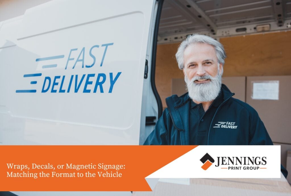
Wraps, Decals, or Magnetic Signage: Matching the Format to the Vehicle
The right format depends on the vehicle, the budget, and how the vehicle is used.
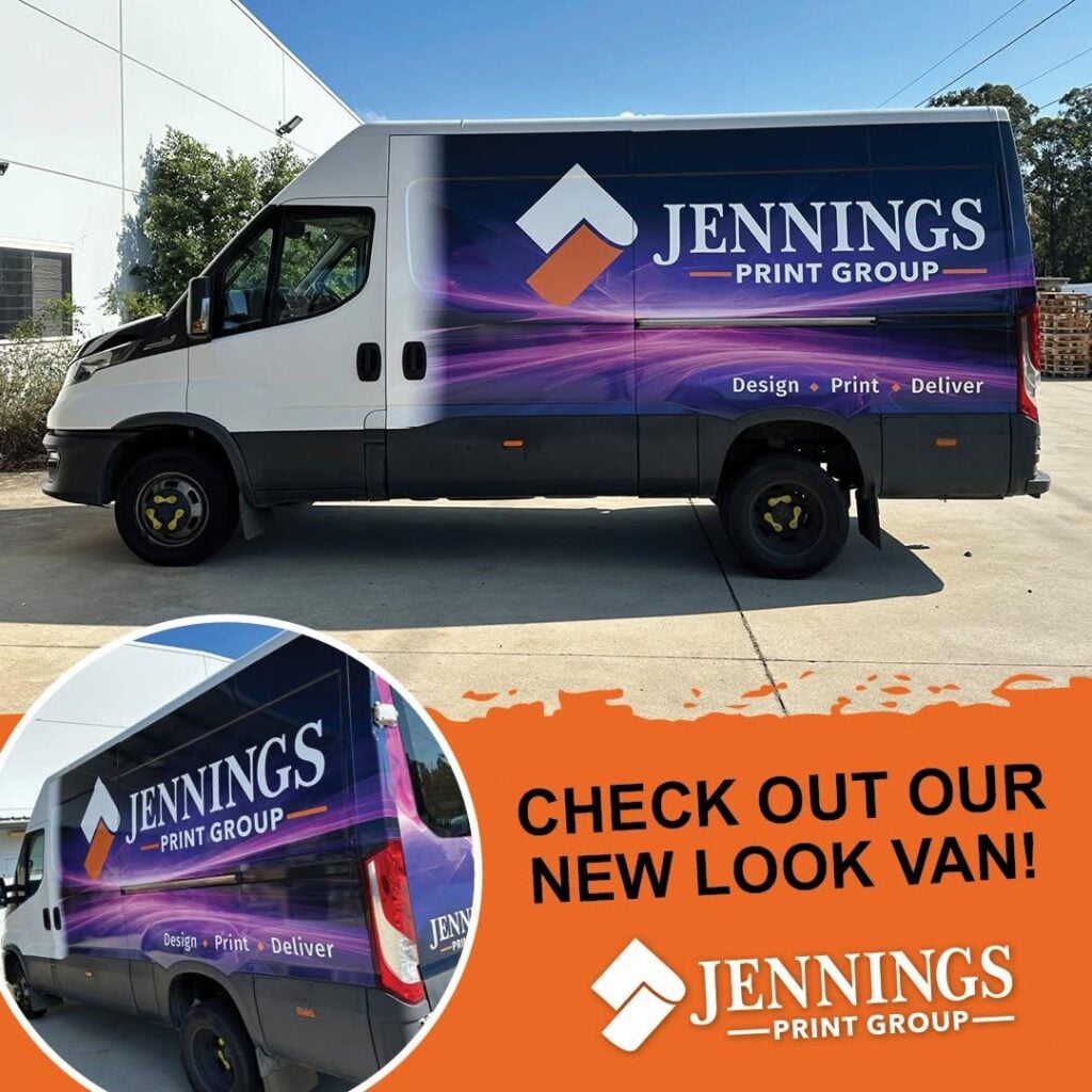
Full or partial vehicle wraps cover the most panel area and give the strongest visual impact, suited to dedicated work vehicles used daily for the business. They’re a longer-term investment, typically lasting five or more years with proper care.
Cut vinyl decals are a more cost-effective option for businesses wanting the key information, meaning logo, name and phone number, without full panel coverage. They work particularly well on utes and smaller vans where a full wrap might be overkill for the vehicle’s size and use.
Magnetic signage suits businesses using a personal or shared vehicle for work some of the time, where permanent branding isn’t appropriate. It’s removable, which is useful for vehicles that need to revert to unbranded use outside work hours, though it doesn’t offer the same durability or polished look as a wrap or decal.
Getting Your Fleet Branding Right
A work vehicle is one of the few advertising assets that pays for itself continuously without an ongoing media spend. Getting the content, hierarchy, and placement right is what determines whether that asset generates calls and bookings, or just looks decent parked outside the depot.
Jennings Print works with trade and delivery businesses on everything from single-vehicle decals through to full fleet wraps, alongside the signage that often goes with a growing business, including site signs, safety signage, and branded signage for the depot or office. If you’re planning your first vehicle branding or refreshing an existing fleet, it’s worth talking through what needs to go on the vehicle before locking in a design.
Browse our range of signage and vehicle graphics options, or get in touch with the team to talk through what makes sense for your fleet.